> ## Documentation Index
> Fetch the complete documentation index at: https://ophel.app/docs/llms.txt
> Use this file to discover all available pages before exploring further.

# Navigate the Ophel panel: tabs, buttons, and modes

> Learn how Ophel's side panel is organized — three tabs, a header toolbar, floating quick buttons, ghost pass-through mode, edge snap, and keyboard shortcuts.

export const ShortcutLegend = ({lang = "en"}) => {
  const isZh = lang === "zh";
  return <div className="ophel-shortcut-legend" role="note">
      <div className="ophel-shortcut-legend-title">
        {isZh ? "跨平台按键说明" : "Cross-platform key mapping"}
      </div>
      <div className="ophel-shortcut-legend-body">
        {isZh ? <>
            文档中的快捷键会同时显示 Windows/Linux 与 Mac 写法：
            <code>Ctrl</code> 对应 <code>Command</code>，
            <code>Alt</code> 对应 <code>Option</code>。唯一例外是提示词发送，
            <code>Ctrl+Enter</code> 在 Mac 上也使用 <code>Ctrl+Enter</code>。
          </> : <>
            Shortcuts show both Windows/Linux and Mac keys: <code>Ctrl</code> maps
            to <code>Command</code>, and <code>Alt</code> maps to
            <code>Option</code>. Prompt submit is the only exception:
            <code>Ctrl+Enter</code> remains <code>Ctrl+Enter</code> on Mac.
          </>}
      </div>
    </div>;
};

export const Shortcut = ({combo, mac, sameOnMac = false}) => {
  const keyLabels = {
    arrowup: {
      win: "Up",
      mac: "↑"
    },
    arrowdown: {
      win: "Down",
      mac: "↓"
    },
    arrowleft: {
      win: "Left",
      mac: "←"
    },
    arrowright: {
      win: "Right",
      mac: "→"
    },
    up: {
      win: "Up",
      mac: "↑"
    },
    down: {
      win: "Down",
      mac: "↓"
    },
    left: {
      win: "Left",
      mac: "←"
    },
    right: {
      win: "Right",
      mac: "→"
    },
    esc: {
      win: "Esc",
      mac: "Esc"
    },
    escape: {
      win: "Esc",
      mac: "Esc"
    },
    enter: {
      win: "Enter",
      mac: "Enter"
    },
    shift: {
      win: "Shift",
      mac: "⇧"
    },
    backslash: {
      win: "\\",
      mac: "\\"
    }
  };
  const modifierLabels = {
    ctrl: {
      win: "Ctrl",
      mac: "⌘"
    },
    control: {
      win: "Ctrl",
      mac: "⌘"
    },
    cmd: {
      win: "Ctrl",
      mac: "⌘"
    },
    command: {
      win: "Ctrl",
      mac: "⌘"
    },
    alt: {
      win: "Alt",
      mac: "⌥"
    },
    option: {
      win: "Alt",
      mac: "⌥"
    },
    shift: {
      win: "Shift",
      mac: "⇧"
    }
  };
  const normalizeToken = token => String(token || "").trim();
  const formatKey = (token, platform) => {
    const normalized = normalizeToken(token);
    const key = normalized.toLowerCase();
    const mapped = keyLabels[key];
    if (mapped) return mapped[platform];
    if (normalized.length === 1) return normalized.toUpperCase();
    return normalized;
  };
  const formatCombo = (value, platform) => String(value || "").split("+").map(normalizeToken).filter(Boolean).map(token => {
    const mapped = modifierLabels[token.toLowerCase()];
    return mapped ? mapped[platform] : formatKey(token, platform);
  }).join(platform === "mac" ? "" : "+");
  const windowsLabel = formatCombo(combo, "win");
  const macLabel = sameOnMac ? windowsLabel : mac || formatCombo(combo, "mac");
  const title = windowsLabel === macLabel ? windowsLabel : `Windows/Linux: ${windowsLabel}; Mac: ${macLabel}`;
  return <span className="ophel-shortcut" title={title}>
      <code>{windowsLabel}</code>
      {windowsLabel !== macLabel && <>
          <span className="ophel-shortcut-separator"> / </span>
          <code>{macLabel}</code>
        </>}
    </span>;
};

export const Icon = ({src, alt}) => <img src={typeof window !== "undefined" && typeof src === "string" && src.startsWith("/images/icons/") && (window.location.pathname === "/docs" || window.location.pathname.startsWith("/docs/")) ? `/docs${src}` : src} alt={alt} width="18" height="18" style={{
  display: "inline-block",
  verticalAlign: "-0.2em",
  margin: "0 0.15em"
}} />;

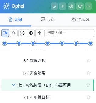
After you install Ophel Atlas and open any supported AI site, the panel activates automatically. A side panel appears on the right edge of the screen, and a small group of floating quick-action buttons appear nearby. This page explains how each part of the panel works so you can navigate it efficiently from day one.

If the panel does not appear, press <Shortcut combo="alt+p" /> to open it.

## The three tabs

<img src="https://mintcdn.com/urzeye/AGLEIfLkr4uHH1zd/images/panel/panel-tabs.png?fit=max&auto=format&n=AGLEIfLkr4uHH1zd&q=85&s=141737be3544a5375f83ad741b340b24" alt="Ophel side panel — three tabs overview" width="315" height="338" data-path="images/panel/panel-tabs.png" />

The panel has three tabs along the top. Click a tab label to switch, or use <Shortcut combo="alt+1" />, <Shortcut combo="alt+2" />, <Shortcut combo="alt+3" />.

<CardGroup cols={3}>
  <Card title="Outline" icon="list-tree">
    A live, auto-generated table of contents for the current conversation. Click
    any heading to jump to it instantly. Supports collapse, expand, search,
    bookmarks, and real-time word counts.
  </Card>

  <Card title="Conversations" icon="folder-open">
    The current AI platform's conversation history in one organized view.
    Organize conversations into folders and tags, search with syntax filters, and export
    to <Icon src="/docs/images/icons/markdown.svg" alt="Markdown file icon" />
    Markdown, <Icon src="/docs/images/icons/json-file.svg" alt="JSON file icon" />
    JSON, or <Icon src="/docs/images/icons/txt-file.svg" alt="TXT file icon" /> TXT.
  </Card>

  <Card title="Prompts" icon="wand-magic-sparkles">
    Your personal prompt library. Click a prompt to insert it into the chat
    input box; double-click to insert and send immediately. Supports variable
    substitution, categories, and pinning.
  </Card>
</CardGroup>

Drag a tab label to reorder the visible tabs. Ophel saves the new order immediately and mirrors it in Settings, so you do not need to open the options page first.

## Panel header

The strip at the very top of the panel gives you fast access to core controls.

| Element                                                                           | Action                                                                                                                                                                                                                                |
| --------------------------------------------------------------------------------- | ------------------------------------------------------------------------------------------------------------------------------------------------------------------------------------------------------------------------------------- |
| **Title area**                                                                    | Hover to see a random usage tip with shortcuts adapted to your OS and key bindings. Double-click to toggle privacy mode, which hides the tab title.                                                                                   |
| **Mode toggle**                                                                   | Switches between Edge Snap and Floating mode with one click.                                                                                                                                                                          |
| **Theme toggle**                                                                  | Switches between light and dark mode. Shortcut: <Shortcut combo="alt+d" />.                                                                                                                                                           |
| <Icon src="/docs/images/icons/settings.svg" alt="Settings icon" /> **Settings button** | Opens the settings dialog. You can also press <Shortcut combo="alt+," /> or click <Icon src="/docs/images/icons/tools.svg" alt="Toolbox icon" /> **Toolbox** → <Icon src="/docs/images/icons/settings.svg" alt="Settings icon" /> **Settings**. |

You can drag the title bar to reposition the panel anywhere on screen when it is in Floating mode. **Double-clicking** the title bar toggles between Edge Snap and Floating mode without opening settings. In Floating mode, drag the resize handle on the panel edge facing the page to change the saved panel width directly.

## Floating quick buttons

<img src="https://mintcdn.com/urzeye/AGLEIfLkr4uHH1zd/images/panel/floating-buttons.png?fit=max&auto=format&n=AGLEIfLkr4uHH1zd&q=85&s=3407c52ae11d8640fe975e95fb507cf6" alt="Floating quick buttons — expanded state and collapsed pill" width="64" height="433" data-path="images/panel/floating-buttons.png" />

The floating button group at the screen edge is your fastest access point to common actions without opening the full panel.

* The group **auto-collapses** into a pill shape after about 5 seconds of inactivity. By default, moving your cursor within **150 px** of it expands it again. The wake distance is configurable: go to **Settings → Quick Buttons → Proximity Wake Radius** (0–300 px). Set it to **0** to enable dwell-hover mode — the group only expands after the cursor rests on the pill for 300 ms, so simply passing through it does not trigger expansion.
* When the group is collapsed, hover the panel logo for a short dwell to open a temporary panel preview beside the buttons. Moving away hides the preview; clicking the logo still opens or closes the panel persistently.
* **Long-press and drag** any button to reposition the entire group to a different spot on screen.

Default icons in the button group:

| Icon                                                                                            | Action                                                                                                            |
| ----------------------------------------------------------------------------------------------- | ----------------------------------------------------------------------------------------------------------------- |
| <Icon src="/docs/images/icons/sparkle.svg" alt="Panel toggle icon" /> **Panel toggle**               | Opens or closes the Ophel panel. When the group is collapsed, a short dwell previews the panel temporarily.       |
| <Icon src="/docs/images/icons/tools.svg" alt="Toolbox icon" /> **Toolbox**                           | Opens additional conversation and page actions.                                                                   |
| <Icon src="/docs/images/icons/search.svg" alt="Global search icon" /> **Global search**              | Opens global search across outlines, conversations, prompts, and settings.                                        |
| <Icon src="/docs/images/icons/theme-system.svg" alt="Theme toggle icon" /> **Theme toggle**          | Switches between light and dark mode; the icon changes with the current theme state.                              |
| <Icon src="/docs/images/icons/eye.svg" alt="Zen mode icon" /> **Zen mode**                           | Toggles Zen Mode for the current site. Enabling it also enables Clean Mode, and the icon changes to a closed eye. |
| <Icon src="/docs/images/icons/settings.svg" alt="Settings icon" /> **Settings**                      | Opens the settings dialog.                                                                                        |
| <Icon src="/docs/images/icons/scroll-top.svg" alt="Scroll to top icon" /> **Scroll to top**          | Loads full history and jumps to the top of the current conversation.                                              |
| <Icon src="/docs/images/icons/anchor.svg" alt="Return to anchor icon" /> **Return to anchor**        | Jumps back to the last saved position and saves the current position as the new anchor.                           |
| <Icon src="/docs/images/icons/scroll-bottom.svg" alt="Scroll to bottom icon" /> **Scroll to bottom** | Jumps to the latest message.                                                                                      |

Click <Icon src="/docs/images/icons/tools.svg" alt="Toolbox icon" /> **Toolbox** to reveal these menu icons:

| Icon                                                                                                    | Action                                                                                                    |
| ------------------------------------------------------------------------------------------------------- | --------------------------------------------------------------------------------------------------------- |
| <Icon src="/docs/images/icons/export.svg" alt="Export icon" /> **Export**                                    | Exports the current conversation.                                                                         |
| <Icon src="/docs/images/icons/segmented-export.svg" alt="Segmented export icon" /> **Export segments**       | Selects and exports specific parts of the current conversation.                                           |
| <Icon src="/docs/images/icons/copy.svg" alt="Copy Markdown icon" /> **Copy Markdown**                        | Copies the current conversation as Markdown.                                                              |
| <Icon src="/docs/images/icons/folder-move.svg" alt="Move conversation icon" /> **Move conversation**         | Selects a target folder and moves the current conversation.                                               |
| <Icon src="/docs/images/icons/tag.svg" alt="Set tag icon" /> **Set tag**                                     | Adds, removes, or changes tags on the current conversation.                                               |
| <Icon src="/docs/images/icons/scroll-lock.svg" alt="Scroll lock icon" /> **Scroll lock**                     | Locks the page scroll position to prevent automatic jumps.                                                |
| <Icon src="/docs/images/icons/model-lock.svg" alt="Model lock icon" /> **Model lock**                        | Applies the configured model keyword for the current site; if none is configured, it opens site settings. |
| <Icon src="/docs/images/icons/cleanup.svg" alt="Clear invalid bookmarks icon" /> **Clear invalid bookmarks** | Removes invalid bookmarks / anchor records from the current conversation.                                 |
| <Icon src="/docs/images/icons/settings.svg" alt="Settings icon" /> **Settings**                              | Opens the settings dialog.                                                                                |

**Additional settings** (`Settings → Quick Buttons`):

| Setting                     | Description                                                                                                 |
| --------------------------- | ----------------------------------------------------------------------------------------------------------- |
| **Proximity Wake Radius**   | Distance (px) at which the cursor wakes up the collapsed pill (default 150). Set to 0 for dwell-hover mode. |
| **Opacity**                 | Transparency of the button group in its collapsed / idle state.                                             |
| **Hide when panel is open** | Automatically collapses the quick button group while the panel is open; it reappears when the panel closes. |

## Keyboard shortcuts

<ShortcutLegend />

| Action                      | Default shortcut                              |
| --------------------------- | --------------------------------------------- |
| Open / close panel          | <Shortcut combo="alt+p" />                    |
| Toggle panel mode           | <Shortcut combo="alt+m" />                    |
| Switch to Outline tab       | <Shortcut combo="alt+1" />                    |
| Switch to Conversations tab | <Shortcut combo="alt+2" />                    |
| Switch to Prompts tab       | <Shortcut combo="alt+3" />                    |
| Global search               | <Shortcut combo="ctrl+k" /> or double `Shift` |
| Toggle light / dark         | <Shortcut combo="alt+d" />                    |
| Open settings               | <Shortcut combo="alt+," />                    |

## Global search

Press <Shortcut combo="ctrl+k" />, tap `Shift` twice, or click the <Icon src="/docs/images/icons/search.svg" alt="Global search icon" /> search icon in the floating quick buttons to open global search. It searches across your outline headings, current platform conversation history, prompt library, and settings in a single query. You can also use advanced syntax filters:

| Filter    | Example        | Effect                              |
| --------- | -------------- | ----------------------------------- |
| `folder:` | `folder:work`  | Limit to a specific folder          |
| `tag:`    | `tag:research` | Limit to a specific tag             |
| `type:`   | `type:prompt`  | Limit to a content type             |
| `date:`   | `date:2025-01` | Limit to a date range               |
| `level:`  | `level:2`      | Limit to a heading level in Outline |
| `is:`     | `is:pinned`    | Limit to pinned items               |

## Ghost pass-through mode

<img src="https://mintcdn.com/urzeye/AGLEIfLkr4uHH1zd/images/panel/ghost-mode.webp?fit=max&auto=format&n=AGLEIfLkr4uHH1zd&q=85&s=a81f47df60ac520403b297f7d57c8800" alt="Ghost mode — semi-transparent panel with click-through enabled" width="408" height="918" data-path="images/panel/ghost-mode.webp" />


The panel sometimes sits over content you need to click on the AI page. Instead of closing the panel, use ghost mode:

Hold <Shortcut combo="ctrl" /> for about 0.2 seconds on its own. The panel turns semi-transparent and mouse clicks pass directly through it to the page behind. Release the key to return to normal mode.
<Tip>
  Ghost mode is useful when the AI response contains a button or link that the
  panel overlaps. You do not need to close or move the panel — just hold the
  modifier key, click, then release.
</Tip>

## Edge snap and floating mode

<img src="https://mintcdn.com/urzeye/AGLEIfLkr4uHH1zd/images/panel/edge-snap.webp?fit=max&auto=format&n=AGLEIfLkr4uHH1zd&q=85&s=f407ec517efad7c00b3870e20fe60758" alt="Panel edge snap — hover to peek preview" width="408" height="918" data-path="images/panel/edge-snap.webp" />


The panel operates in one of two modes. Switch between them using the **mode toggle button** in the panel header, or go to **Settings → General → Panel → Panel Mode**.

| Mode          | Behavior                                                                                                                     |
| ------------- | ---------------------------------------------------------------------------------------------------------------------------- |
| **Edge Snap** | The panel hugs the screen edge and stays hidden. Hover over the edge to peek at the panel content.                           |
| **Floating**  | The panel floats above the page, stays fully visible at all times, and can be freely repositioned by dragging the title bar. |

In Edge Snap mode, dragging the panel title bar pulls it away from the edge, switching it to Floating mode. While dragging, move it to the opposite side of the screen to change the snap direction.

### Panel size and position settings

All of these are in **Settings → General → Panel**:

| Setting               | Description                                                                        | Default  |
| --------------------- | ---------------------------------------------------------------------------------- | -------- |
| Panel mode            | Edge Snap or Floating                                                              | Floating |
| Default side          | Left or right side of the screen                                                   | Right    |
| Panel width           | Saved panel width; can also be changed by dragging the Floating panel edge         | 320 px   |
| Widen on hover (Beta) | Temporarily widens the Floating panel while your cursor or keyboard focus is on it | Off      |
| Hover width (Beta)    | Temporary width used while **Widen on hover** is active                            | 520 px   |
| Panel height          | 50–100 vh                                                                          | 85 vh    |
| Edge distance         | Distance from the screen edge when in Floating mode                                | 0 px     |
| Snap threshold        | Distance from edge that triggers automatic snapping                                | 30 px    |

### Quick buttons behavior

In **Settings → General → Quick Buttons Behavior**, you can also toggle:

* **Hide quick buttons when panel is open** — the floating button group automatically hides while the panel is open, and reappears when you close the panel.

## Next steps

<CardGroup cols={2}>
  <Card title="Smart outline" icon="list-tree" href="/docs/features/outline">
    Learn how the live outline works — locate mode, follow mode, bookmarks, and
    word counts.
  </Card>

  <Card title="Conversation management" icon="folder-open" href="/docs/features/conversations">
    Organize your chat history with folders, tags, search, and batch exports.
  </Card>

  <Card title="Prompt library" icon="wand-magic-sparkles" href="/docs/features/prompts">
    Build and use a reusable prompt library with variable templates and a prompt
    queue.
  </Card>

  <Card title="Shortcuts" icon="keyboard" href="/docs/customization/shortcuts">
    View the full shortcut reference and configure custom key bindings.
  </Card>
</CardGroup>
